Design
# We design by _inspiration._
The best interfaces on the web have already solved most design problems. We find what’s working, take it apart, and apply the lessons to your product — so it looks considered from day one.
[See the inspiration library ↓](#gallery)
The method
## Select what’s working. Deconstruct it. Apply it.
1. 01Sweep
### Start from what already works
We gather three to five references from products that are winning — in your market and outside it — and always one that isn't the safe choice.
2. 02Taste
### You choose. We annotate.
Every reference gets a LIKE and a SKIP. The "not like this" list matters as much as the favourites — it's what stops a design drifting back to generic.
3. 03Deconstruct
### Measure, don't eyeball
Color roles and when each one fires. Type weights and tracking. Spacing rhythm, corner radius, button anatomy. The components, taken apart.
4. 04Apply
### Your product, their lessons
We name the direction in two or three words, map it onto your design tokens, build — then verify side by side against the source.
The inspiration library
## Popular products, taken apart.
The real site, then its palette, type and button shape pulled out underneath. Hit **Deconstruct** to see the measured tokens — the part we actually carry into your design.
All 18Light 13Dark 5AI 6Developer tools 3Productivity 3Fintech 2Design 1Commerce 3
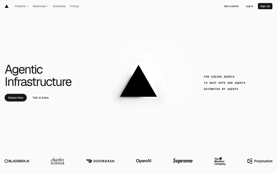
Aa
Vercellight
Get startedLearn more
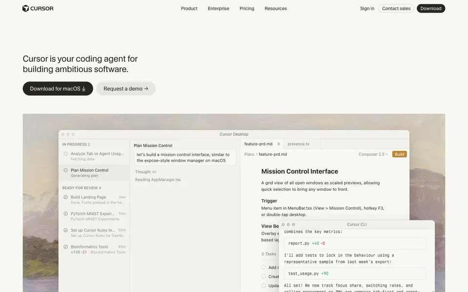
Aa
Cursorlight
Get startedLearn more
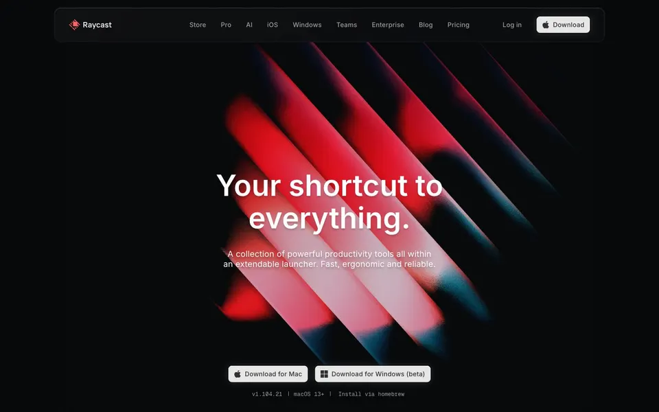
Aa
Raycastdark
Get startedLearn more
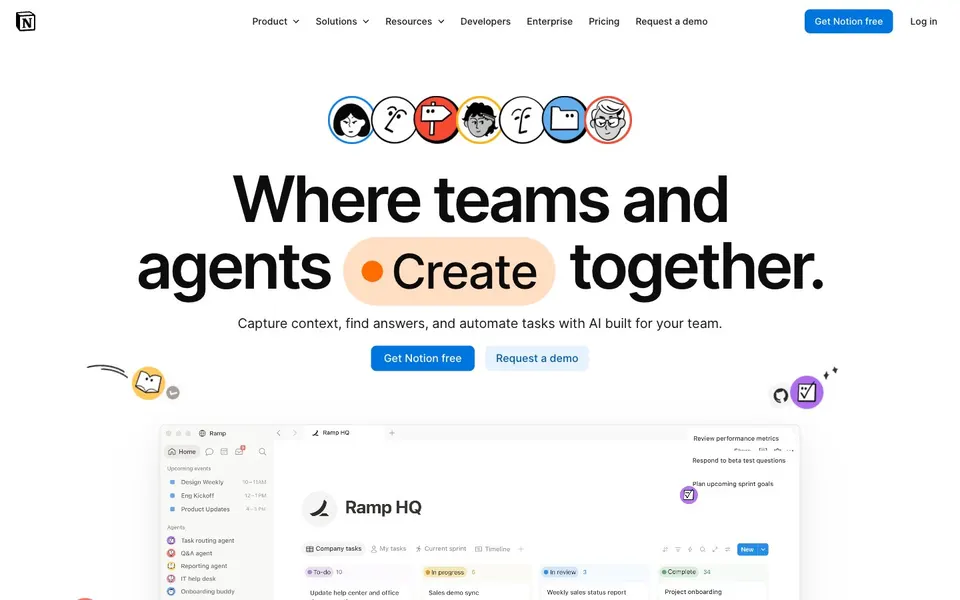
Aa
Notionlight
Get startedLearn more
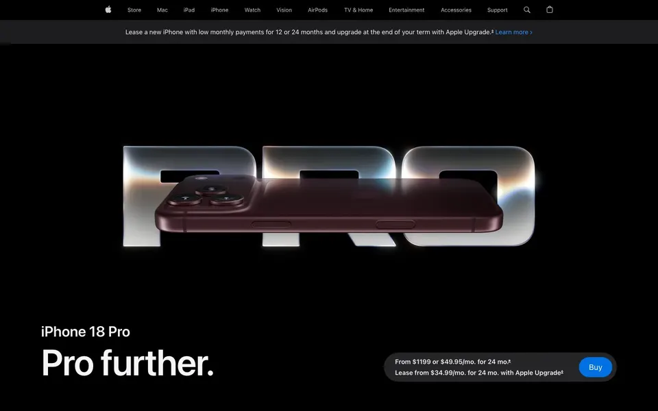
Aa
Appledark
Get startedLearn more
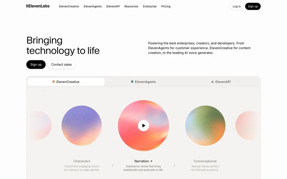
Aa
ElevenLabslight
Get startedLearn more
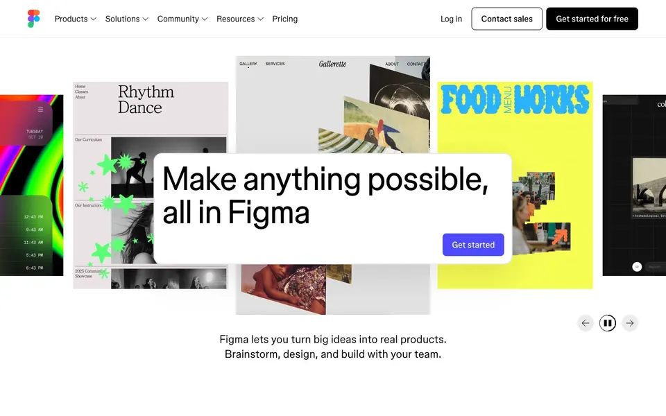
Aa
Figmalight
Get startedLearn more
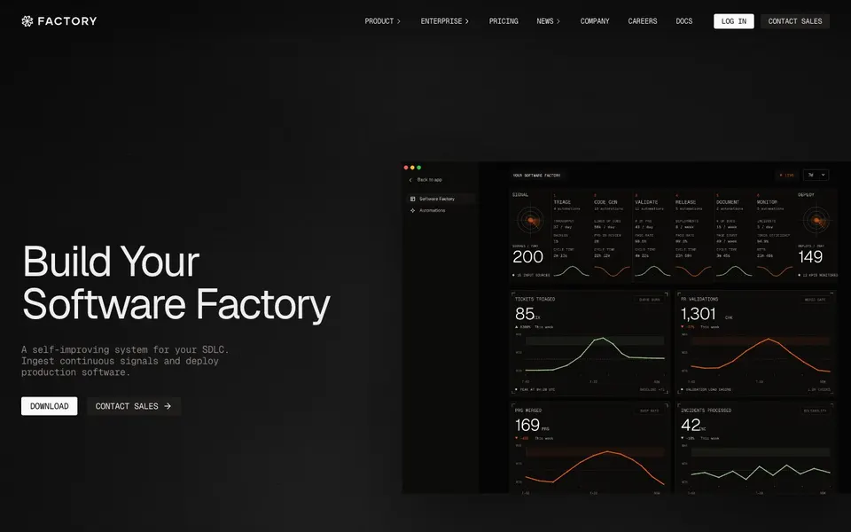
Aa
Factorydark
Get startedLearn more
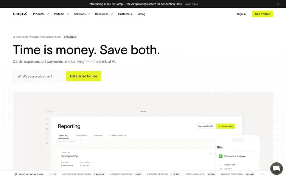
Aa
Ramplight
Get startedLearn more
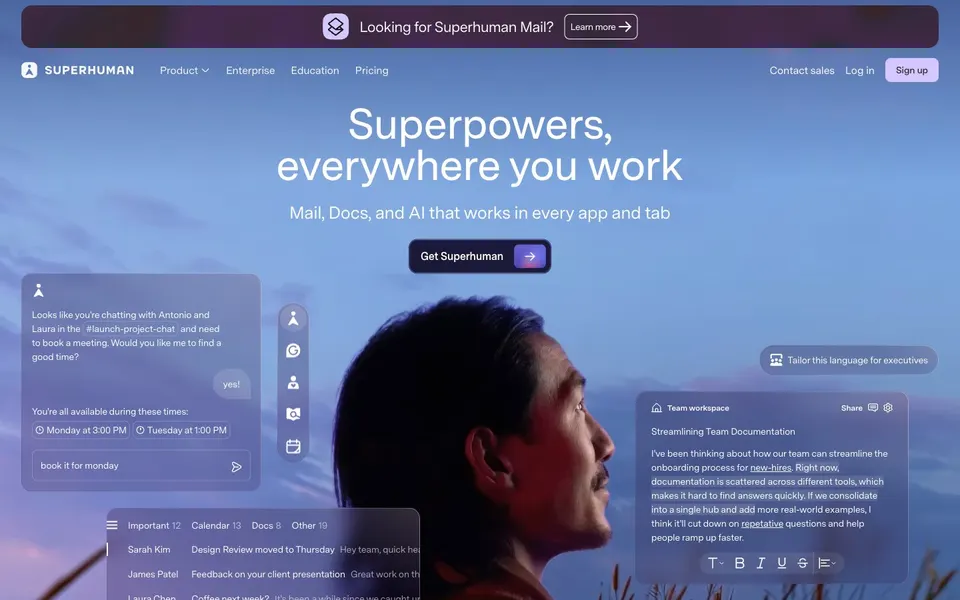
Aa
Superhumanlight
Get startedLearn more
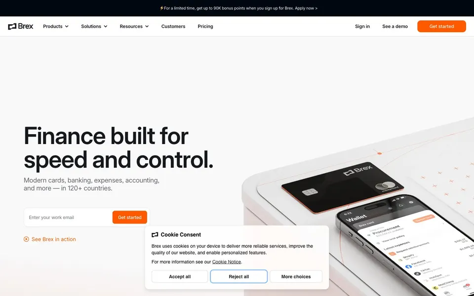
Aa
Brexlight
Get startedLearn more
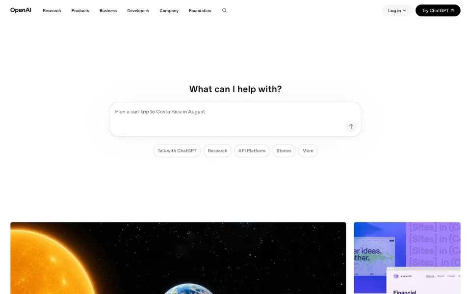
Aa
OpenAIlight
Get startedLearn more
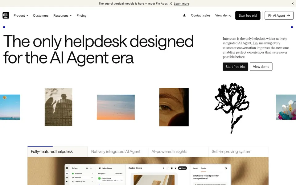
Aa
Intercomlight
Get startedLearn more
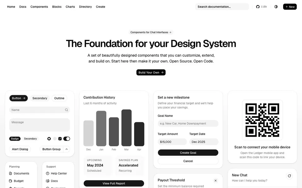
Aa
shadcn/uilight
Get startedLearn more
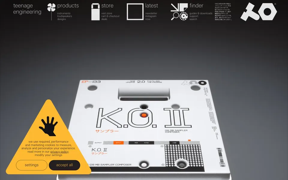
Aa
teenage engineeringlight
Get startedLearn more
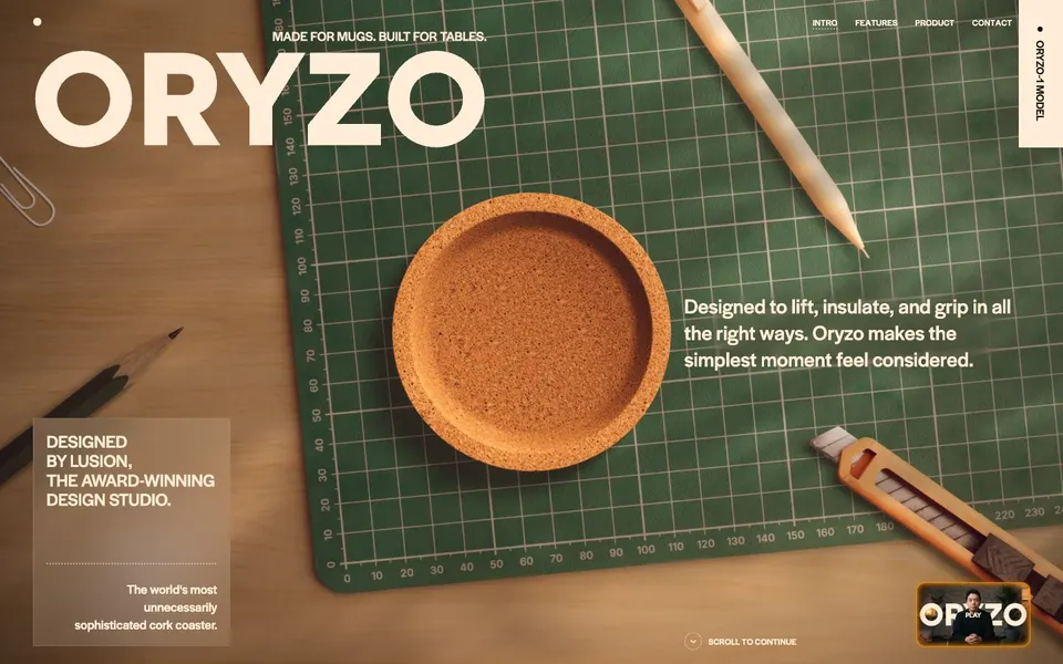
Aa
Oryzodark
Get startedLearn more

Aa
Daladark
Get startedLearn more
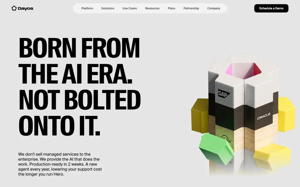
Aa
Dayoslight
Get startedLearn more
Screenshots are each site’s home page. Specimen typefaces are open stand-ins where a brand’s own face is proprietary; the deconstructed side names the original. All trademarks belong to their owners — shown here as study, not affiliation.
What deconstruction teaches
## The lessons are in the rules, not the colors.
Anyone can copy a hex code. What makes a design work is the discipline around it — and that’s what we write down.
0.9%
### Timing beats hex
Cursor's orange lands on fewer than 1 in 100 elements — only links that move you forward. Knowing when a color fires is the lesson; the hex is trivia.
300 · 460
### Weight is a voice
ElevenLabs whispers at 300. Superhuman speaks at 460. Ramp never leaves 400. The weight you never use is as much of the brand as the one you do.
### One accent, one job
Figma allows one indigo button per screen. Brex gives its orange one job per section. Spend color like money and every use of it gets noticed.
### Separation without lines
Apple uses no shadows and almost no borders. Sections separate by alternating bands and generous corners. Fewer lines, calmer page.
150 < 250
### Close faster than open
Things arrive in 250ms and leave in 150. One moment per feature earns a longer animation; everything else stays quick and out of the way.
2–3
### Name it, then build it
"Warm paper minimalism." "Midnight command center." A direction in a few words settles a hundred small decisions before anyone argues about them.
From inspiration to your product
## A deconstruction is a mapping, not a mood board.
Once a direction is chosen, applying it is mechanical: each measured role lands on a token in your design system, and every screen inherits it.
Measured · warm paper minimalism
- Parchment canvas `#f7f7f4`
- Raised surface `#f2f1ed`
- Warm ink `#26251e`
- Ink at reduced alpha `#84847e`
- Ember — forward links only `#f54e00`
- 4px on every corner
Applied · your design tokens
```
--ui-bg-primary: #f7f7f4;
--ui-bg-secondary: #f2f1ed;
--ui-text-primary: #26251e;
--ui-text-secondary: #84847e;
--ui-accent: #f54e00; /* links, never CTAs */
--ui-radius: 4px;
/* every component inherits — no hex in a component */
```
## Bring the sites you admire.
Tell us what you love on the web. We’ll show you what makes it work — and what it looks like on your product.
[Talk about your current challenges →](/start?utm_campaign=design)[How we build →](/development)
Got a question?